Home for Rent is a web-based catalog of available rental units for prospective renters. What differentiates Home for Rent from other sites in the marketplace is the ability for users to collaborate with “home search partners” otherwise known as their future roommates. Users can create a group, add homes to their favorites list, and compare to all users in their group for easy participation.
Role: UI/UX Designer and Researcher from concept to delivery
Responsibilities: User research, wireframing, prototyping, designing, and iterating.
Completed: December 2022
Problem Statement
Many apartment shoppers find collaboration with future roommates difficult because links have to be sent via text or email. users often find themselves having a hard time keeping organized with multiple people when shopping for a new rental.
Hypothesis
If users were able to add and compare favorites with a group of future roommates, collaboration and organization would be much improved.
The Why
Current apartment shoppers are almost exclusively using online platforms to search for their next rental. So much data is available to them, but there are no tools dedicated to their organization or comparison with future roommates.
Pain Points
Unsaved Info
Users of other sites wished that their personal information would populate in each listing that they applied for
Non-collaborative
Many sites make searching for listings with roommates difficult
Poor Filtering
Some sites have mediocre filtering, giving the user a broad range of listings
Personas
Charlie
Age: 22
Education: High School
Hometown: Orlando, FL
Family: Parents
Occupation: Retail employee
Goals
Collaborate with friends in apartment search
Use filters to refine search
Accurate high quality listing photos
Frustrations
No collaboration tools to search with friends
Multiple background checks
Charlie plans to live with friends to save money before he establishes a stable career and/or relationship. He struggles to afford apartment shopping when each application requires a background check
Danielle
Age: 43
Education: Some college
Hometown: Boston, MA
Family: Partner, son (8)
Occupation: Data Analyst
Goals
Only show accurate listings that are still active
Easy filtering
Select specific areas on the map
Frustrations
Hidden costs
Broker fees
Listed units that have already been filled
Danielle works hard in her career, is passionate about her family, and loves her city. She likes living in apartments because she’s not responsible for maintenance, and can move easier than home owners.
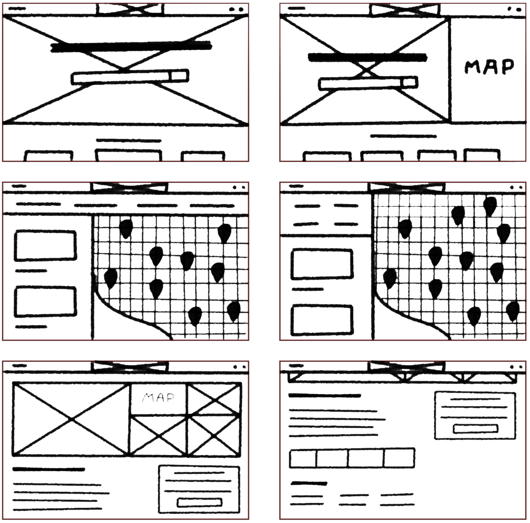
Wireframes
Creating a brand new layout was not necessary because of many strong designs across the industry. Using the best from what they had to offer, a straight-forward design starts to become clear in these wireframes.
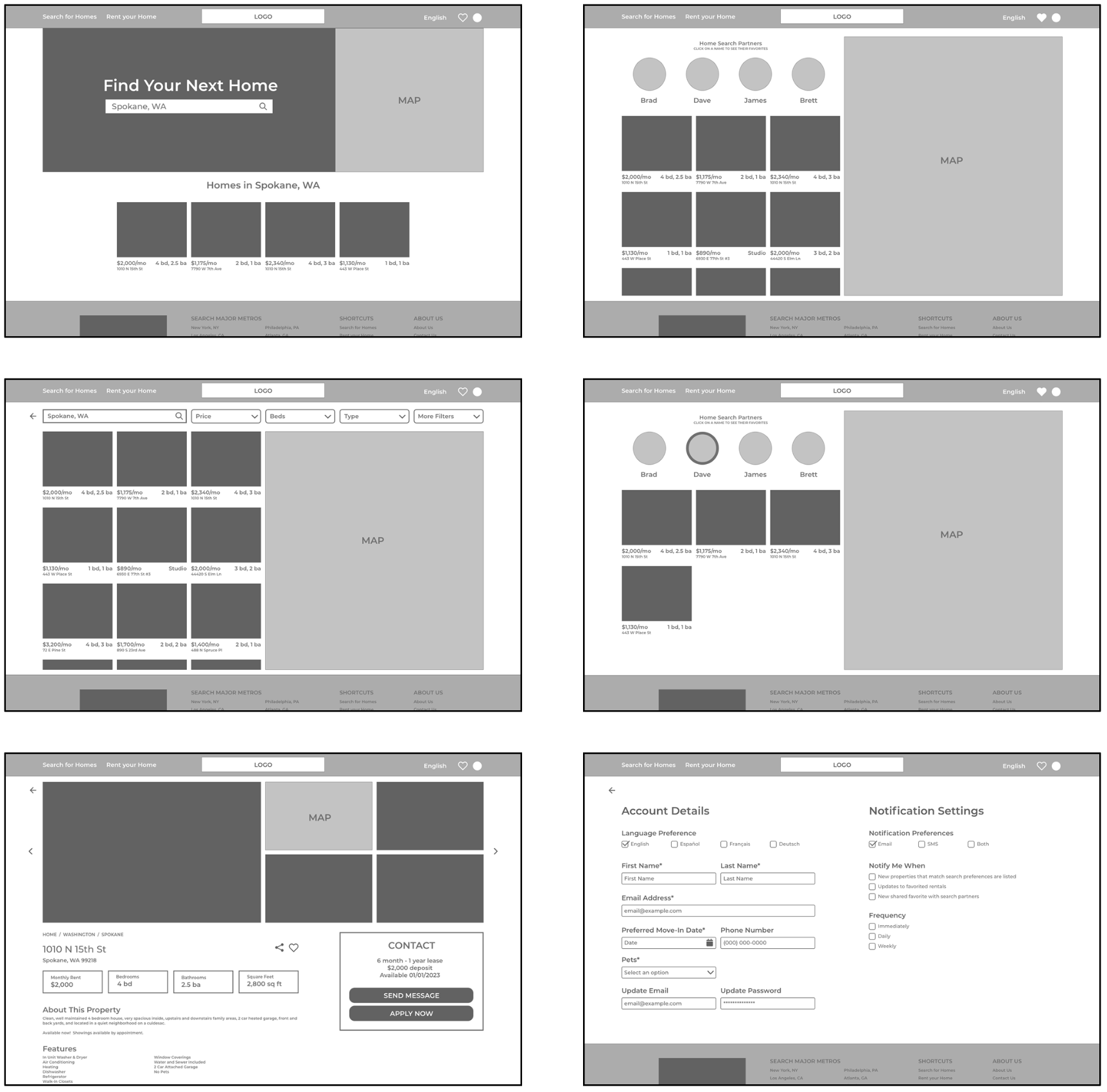
Lo-Fidelity Concept
Adding real elements helped me grasp how layouts will ned to be sized in order for the user to have a seamless experience. Many elements were sized down and more white space was added.
Mockups
Between rounds one and two of the usability study, hi-fidelity mockups were created. This gave users a greater sense of context for the feedback. Users had minimal criticism at this stage of the design.


Click to view the hi-fidelity prototype
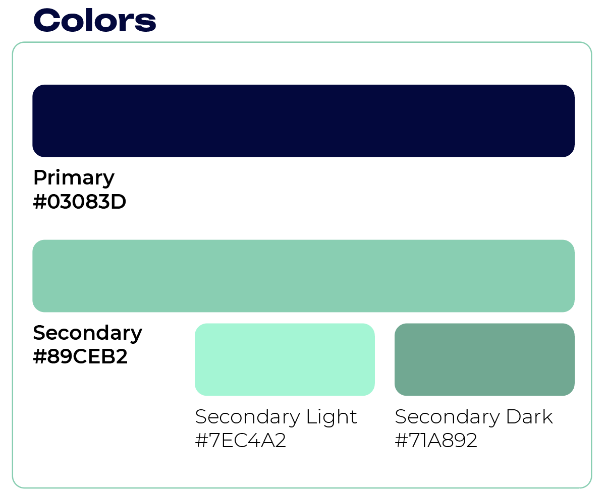
Design Kit
Summary
Key Features
The feature that helps Home for Rent stand out in the marketplace is the Favorites page. This page allows users to collaborate with future roommates in their search for a new apartment.
Users can fill out their personal information in the Profile page to help them save time when applying for multiple properties at once.
Accessibility
Home for Rent is available to users in four different languages.
Built into the filters is an option for low income renters so that they don’t have to dig through available options to find what they are looking for.


